Illustrating your daily dosa happiness
Helping a friend with her line of raw pressed juices is what set Sangita Garg on the path to launching Attagirl, combining her passion for healthy eating with her love for all things dosa.
Attagirl now makes a range of idli and dosa batters with the freshest ingredients for retail across Mumbai. The challenge for us was how best to showcase the entire Attagirl product range while highlighting the freshness and variety of ingredients in each batter.
A relatable, inspirational mascot for Capoeira crianças
CDO India is India's first school for capoeira, the unique martial art form that originated in Brazil and is now cartwheeling its way worldwide. After 12 years of teaching capoeira to adults and kids at their centres and schools across the country, our friends at CDO India realised they weren't hitting the mark with a key audience at their centres - children between the ages of 5 and 12.
Of secret plots and organic logos
A few months ago, one of our favourite people, Sunil Manaktala, asked us to conspire with him on a birthday present for his lovely wife, Rita, who runs an organic farm a ways from Mumbai. And we do love a good conspiring so we jumped right in.
Logotober – Pai & Bee take on logos that make no design sense (to us)
It's October 1, and you know what that means - it's Inktober time! But, this time, instead of Pai doing her usual inking, we're doing something a little twisted. We're taking all the logos we ever looked at and went "huh" re-imagining them for ourselves. We're giving them a little something-something with our distinctive illustrated style and our specific shiny brain logic.
'Why' you ask? Why ever not. This is our way of paying homage to brands we like. (And because their logos make no sense to us. Zero. No dice). Presenting - Logotober.
Label illustrations that look good enough to eat
In designing a logo and visual identity for NaturalMi, the all-natural skincare label run by our l'il Mix, we decided that the best course of action was to go with simple, elegant and luscious. After all, Mix makes her products by the maxim "if it's safe to eat, it's safe to put on your face."
A yearbook in the time of Corona
It was the best of times; it was the worst of times. But really, it was the most medium of times since we were already a year into Our Year of the Great Pandemic Time ™. The task in front of us this February-March seemed like a simple one: B.D. Somani International School asked us to create their annual yearbook, in a year where classes were held entirely online.
A logo for Kiku
When Aparna Massah of Chez Kiku reached out to us in early 2020 to talk about a logo for her new home chef business, I was overjoyed. Food! Drawing! Drawing food! Designing menus! All of my favourite things in one project? So it would seem. And in the year of Our Lockdown 2020, I was glad to drown myself in research and colour palettes, especially as a distraction from, well, gestures at everything.
Drawing deliciousness – Pai’s Foodtober
For the past several years, October has been a month for illustrators to flex their skills, or just get some analog practice, thanks to a community event called Inktober. However, this year, a large part of the community is boycotting Jake Parker's official Inktober hashtag and prompts; here's why. But that's only meant that more and more artists and organizations have put up their own prompt list for everyone to share and enjoy.
The anatomy of a logo
Sawdust.Online speaks about architecture, design, and interiors. The website needed a typographical logo, something minimal, yet fun that brought out immediately that this was a one-stop resource for discussion about all things architecture and interiors. Most of the logo work I’ve done before has been illustration based, but this was to be heavily typographic. This sounded like a fun challenge indeed. Plus, I love fonts. I mean, who doesn’t?
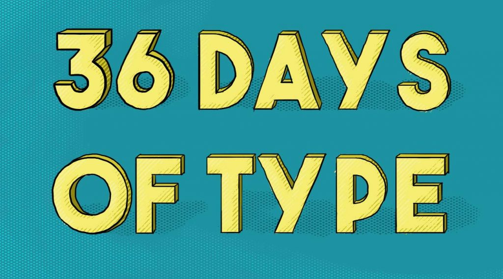
36 days of type

If you're one of those people that begins their morning scrolling through Instagram, you may have noticed the #36daysoftype hashtag take over your feed on a yearly basis. So what on earth is this thing anyway? 36 Days of Type is a project started by Barcelona-based designers Nina Sans and Rafa Goicoechea, inviting illustrators, designers and graphic artists to reinterpret the alphabet, designing a letter or a number each day.


